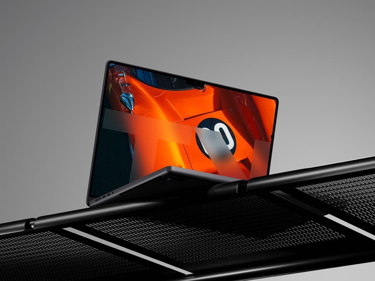
TangentVector / Branding 1

TangentVector / Branding

Question
What identity can carry both mechanical force and cinematic sensitivity?
Medium
Visual, Websites
Year
2026
Role
Design Director / Designer
Skills
Brand Identity, Visual Design, UI/UX, Asset Production

A comprehensive visual identity system for a filmmaking studio, rooted in mathematical precision and cinematic aesthetics.

Details

I redeveloped TangentVector's existing mark using the golden ratio to create a more balanced and impactful brand foundation.

The project expanded into a full identity ecosystem, including custom typography, a bespoke website, and a physical clothing line that reflects the studio's technical and creative rigor.

Process

  1. Refined the existing brand mark by applying golden ratio proportions for improved visual balance
  2. Developed a custom typography font to establish a unique and proprietary brand voice
  3. Designed a comprehensive identity system including pattern designs and brand guidelines
  4. Built and launched a custom website and presentation decks for client-facing communications
  5. Translated the digital identity into physical goods through a custom clothing line and apparel design

The project began with a fairly direct question—how do you brand an automotive film studio? When did that question expand into something broader?

It began with the existing mark, but it quickly became a question about building a complete identity system. Once we were thinking about typography, the website, presentation decks, patterns, and clothing, the challenge was no longer just how to brand an automotive film studio.

It became: what identity can carry both mechanical force and cinematic sensitivity? The system needed to reflect the precision of filmmaking and automotive content, but also the emotion of narrative and storytelling.

When you began rebuilding TangentVector’s identity, what larger idea were you trying to make visible?

It was about balancing the mechanical precision required for automotive filmmaking with the raw emotions of narrative and storytelling. I wanted to tap into the idea of a tangent vector as a mathematical concept while focusing on the simplicity of the pre-existing symbol—the outline of an SD card.

I expanded it slightly to fit the golden ratio, creating a bridge to a new visual identity rooted in the past. The new color palette helped too.

What I was trying to make visible was how much we are not showing.

What did that restraint look like in practice as you refined the SD-card symbol?

Initially I had about five different concepts for the developed SD card, each a little more detailed. In the end, after a lot of debate, we decided to go with the simplest form, which allows maximum openness in compositions.

If the symbol is so popular and so connected to what we are doing as a studio, we have to find a better way to stand out through other means and empower the symbol on its own. That is when the font came into place.

Once the symbol became deliberately simple, what could the custom typeface express that it could not?

With filmmaking, it always starts with words on paper. Seeing the words, how the studio talks about itself, and the names of the people involved, using a custom font became an obvious choice.

It gave us a way to distinguish ourselves. Our words become images, and typography became an interesting focal point that made the entire project feel completely different.

How did you translate the SD-card form into a working type system?

I took an SD card and built every single glyph, every single letter, using that SD card as a baseline. Each letter was designed to fit into the SD card itself, creating a unique yet harmonious font based on the golden ratio and a custom SD symbol.

It has many sharp edges; it is futuristic and modern, with a slightly heavy look reminiscent of race courses and tires. At the same time, it is distinctive enough to raise an eyebrow: “Where is this coming from?

What kind of font is this?” It has a bit of historical tradition, but it is primarily futuristic, modern, and technical.

Because the typeface was intended to become part of the studio’s everyday identity, what did you have to solve beyond the letterforms themselves?

The main challenge was scaling the font so it worked in all programs, such as Figma and Framer. This was my first time creating a custom font, so it was a learning process, and I used an open-source font-making tool.

We also decided to have a secondary font available everywhere as a Google Font. That way, the identity could remain distinctive while still being practical for the studio to use.

How did the existing name, audience, and client familiarity shape what you were ultimately willing to change?

It is a classic tension: you want a refresh and a redesign, but you do not want to lose the spirit or the vibe. This project was an exercise in proposing something bold and then toning it down until it felt familiar.

It is the designer’s responsibility to make concepts more ambitious, then, together with the client, make them more familiar and progressively introduce a new identity with the client’s permission and proactive engagement.

We explored an acronym, TNGNT, but the client wanted to keep the naming similar because of the existing client base and familiarity with the full name.

Once the identity moved beyond the mark, how did you think about making the same idea work across the website, decks, patterns, and clothing?

The project became a full identity ecosystem, so I had to think about how the visual language could move between digital and physical applications. I worked across the website, presentation decks, pattern design, and a clothing line, acting as both design director and designer.

The symbol and type needed to remain recognizable, but the system also had to give us enough flexibility to build different compositions and communicate the studio’s technical and creative rigor in each context.

How did you test whether the system still felt bold after it had been brought back toward familiarity?

At that point, it was all about seeing it in action, so I created many mockups. Using generative AI platforms like Figma Weavy, Google Nano Banana became critical for quickly visualizing the logo on a car, clothing, billboards, stationery—everywhere the brand might appear.

I presented these to the team, and we discussed how it felt and what it conveyed. Seeing the SD cards on a car, especially on the boot, helped us adjust the spacing—deciding where to open it up or tighten it.

What use of the system most clearly confirmed that it was working?

It was the ease with which we created the proper company pitch deck, like a book that states the company’s values. It was a perfect match, and at that point I knew it was really working.

Seeing the client use the font in social-media assets also shows how much bolder and more solid the company appears now compared to the previous identity, which did nothing with the font.

The symbol was similar, but the font makes a real difference.

Looking back at the original question of how to brand an automotive film studio, what did the finished identity ultimately make possible that the old identity could not?

It creates a new platform to state the values and say things that are important—not in a commercial way, if that makes sense. They are not advertising; they are just saying who they are.

But because of the visual language they are using, they are making a statement. Before that, it was not really possible.

See other projects

WOB

How can we lower the friction of water access to turn individual recreation into a modular social experience?

Aeolus / Yacht Design

How can rigorous hydrodynamic modeling inform the aesthetic soul of a high-performance vessel?